
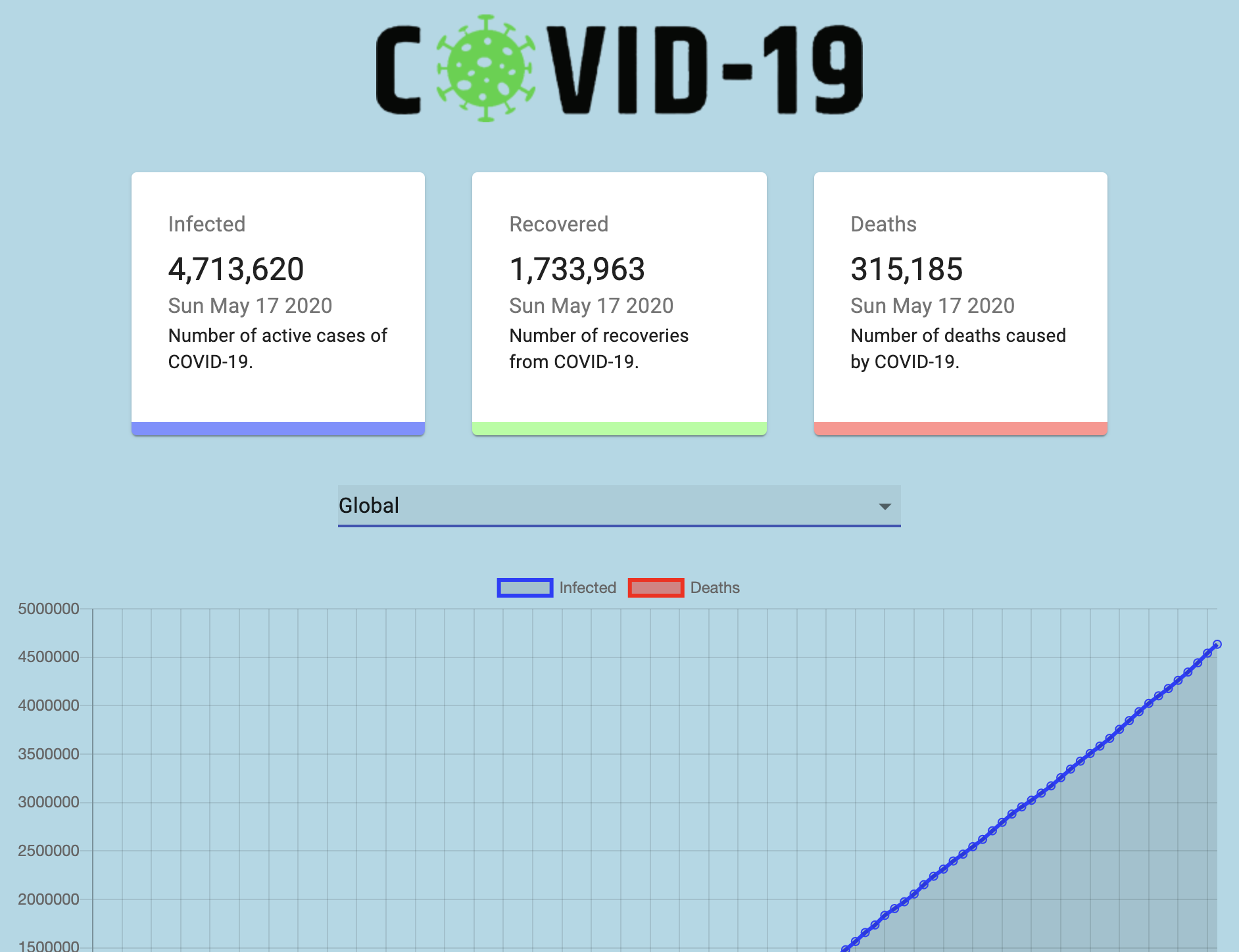
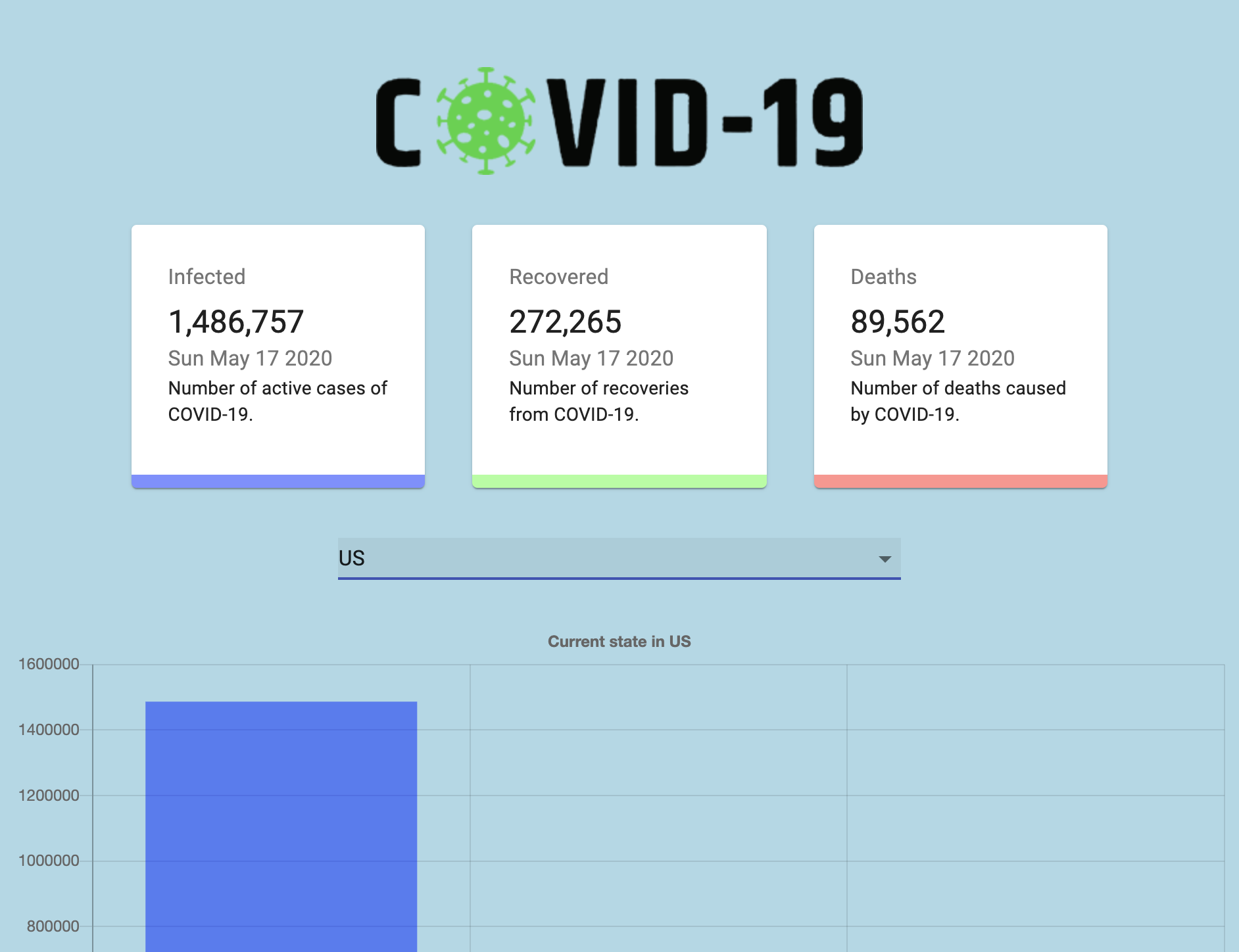
I want to first start off by having a quick run through of my final project. The first picture below shows how the site looks from the beginning. It immediately gets information from the API to display the Global statistics in regard to covid-19. On the live site it would show the numbers flip a bit to give the anticipating viewer the information that they were waiting for in a little suspenseful way. The information first starts with Infected then Recovered, then lastly deaths. Everything on the site is colored coded to three colors: Blue for Infected, Green for Recovered, and Red for Deaths.
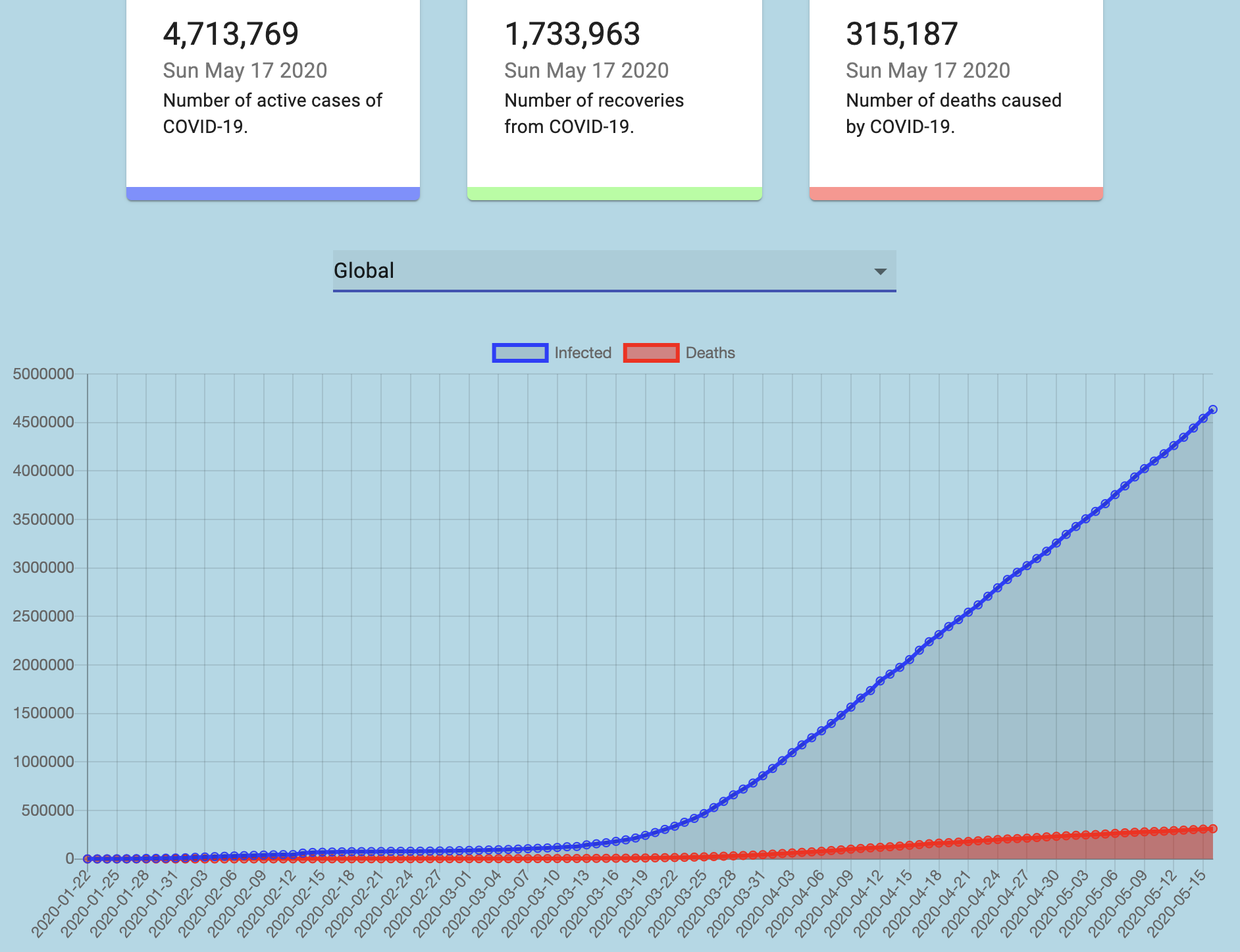
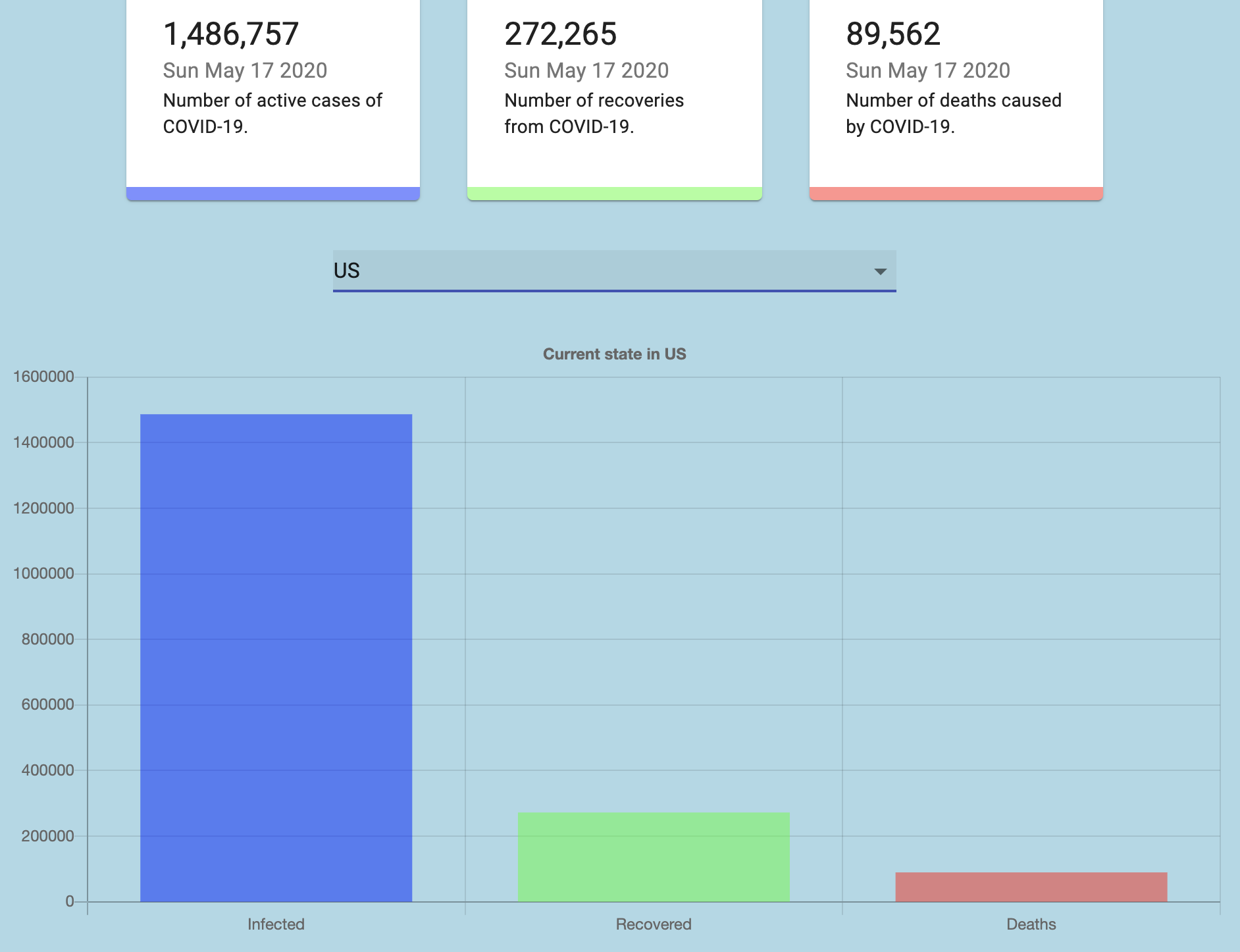
The second picture below this is the lower half of the site. When I first implemented the site it only contained the upper half of the site which had the dropdown menu, three display squares, and the title picture. I always wanted to add something more informational to the site to get the overall message of importance and seriousness about his virus. I know you said no graphs but in order to provoke this feeling of shock and fear, and to show the large scale impact of this virus I knew a graph would be beneficial because nothing is more scarier than numbers. The graph helps solidify the overall theme I wanted to give of seriousness and let the user know that this virus is serious. To make this graph I used React Charts 2 which is a library to make charts in React. It was very fun to implement and I think it came out amazing. The graph displays information from a month time span to really show how quick and dangerous this virus is. Using the same color system as above blue represents the global infected while red shows the global death.
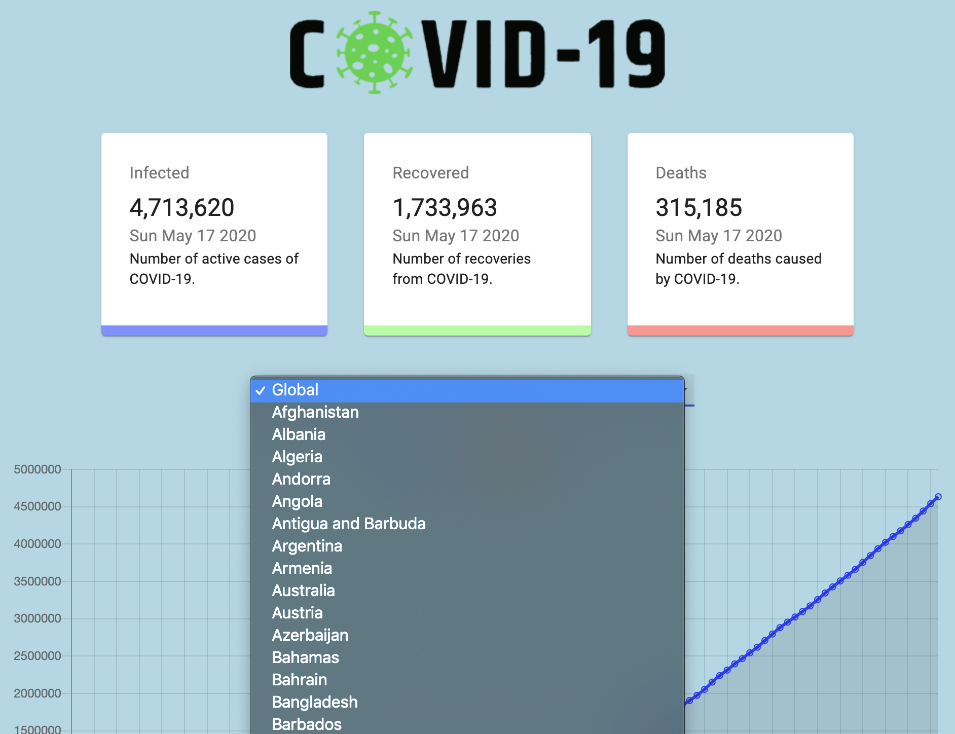
In the next image below shows the ability of the dropdown menu. All the countries information is brought forth by the API. In order to implement a unique UI layout like this I downloaded material-ui in order to bring these elements. The api contains almost all the countries so the user can have their look at how impactful and serious this virus is. I think having a wide selection like this simulates the idea and though of the large scale I pact of covid-19 all over the world.
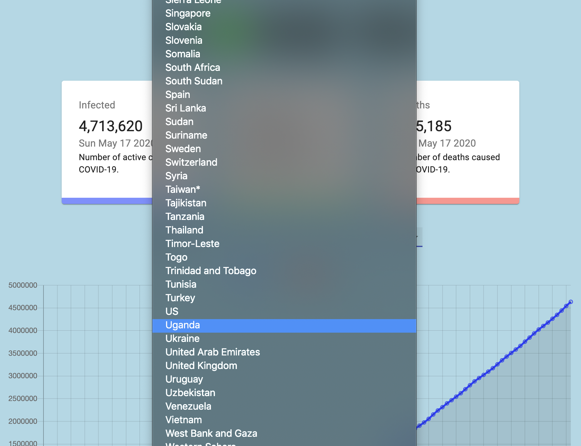
The image below continues the long list of nations this api has to offer. The unique features I wanted to point out is on Taiwan there is an asterisk because the information is just an estimate and not official so it shares the same numbers as China. Another feature is the ability to select areas like West Bank and Gaza areas that are not exactly nations but if information is given from anywhere it is displayed right on the site just with a click.
The following image below shows the change of ui when the user selects a country. Here I select the United States which has live statistics following the suspenseful number flip. Each of the informational squares like Infected, Recovered, and Deaths have all been updated to show the most up to date information.
The last image below shows the real ui change made when a country is selected. The line chart before is now a bar graph. The colors of Blue, Green, and Red still follow the same format above. I felt like having a bar graph instead of the line graph here makes the infected count look a lot more drastic which will definitely simulate the user’s thoughts to truly believe that this virus is big and still active which might help people stay at home and follow protocol more.
The video below shows the rapid change of numbers which simulates a different feeling in the viewer. It gives a sense of suspense and hesitation as the viewer looks at the changing numbers attempting to predict what will come. To talk about each separate part of my code I will start with the api folder. It contains an index.js file which by using axios fetches the data from the api. It allows for all the countries to get imported and all the information of recovered, confirmed, deaths, and the latest update to get posted on the site. The App.js file basically takes all the files in the project and sets it up together. Using react this file takes all the information from all the other important components in the project and sets up the data properly. The App.module.css is self-explanatory as it is the css file for the overall app but the reason why I have it set up as a module is because it specifically sets up the styling so it does not affect the styling of the other files. Now in the components folder is the three important aspects of this project. The Cards, The Chart, and The CountryPicker. Each of these files have their own styling. The Cards.js file sets up how the information is set up on the cards for each of the three main squares of information. The Chart.js file sets up the overall layout of the two different charts. The line graph and bar graph are both set up here according to user input. Here the graph fetches the data from the api and sets it up according to its parameters and color code. CountryPicker.js is also self-explanatory as it fetches all the possible countries which have covid-19 related data and sends their information to the site. This uses '@material-ui/core' to specifically set up it own ui in order to properly display all the countries coming from this api. The components folder also gets its own index file which basically sets up all the three files together to export the data from each. Lastly we come to the main index.js file which takes all the components gathered from the App.js file and renders all the information live using react-dom.